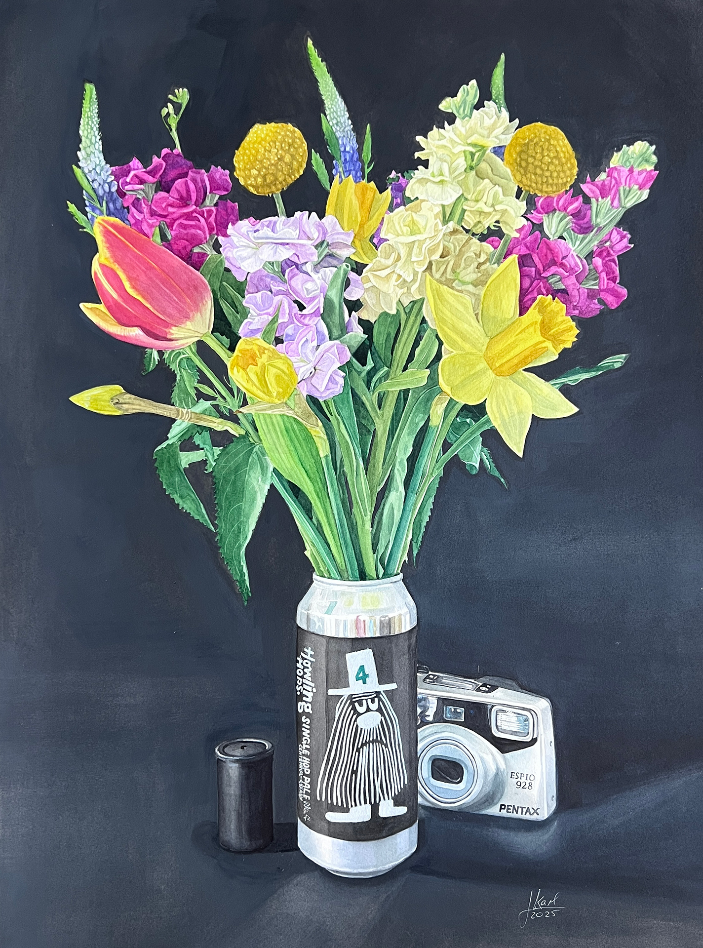
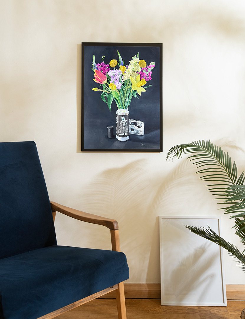
Number 3: The Analog One
This piece was probably the one I struggled with the most—from the initial concept to the background painting and matching colours for print. I had already taken reference pictures of the can with the flowers when I created the first painting. However, after realizing that the composition didn’t work on its own and that additional elements were needed, I spent weeks trying to find the right concept.
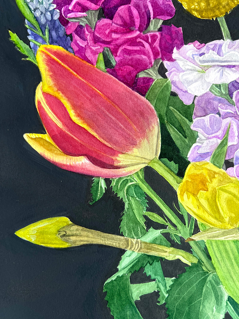
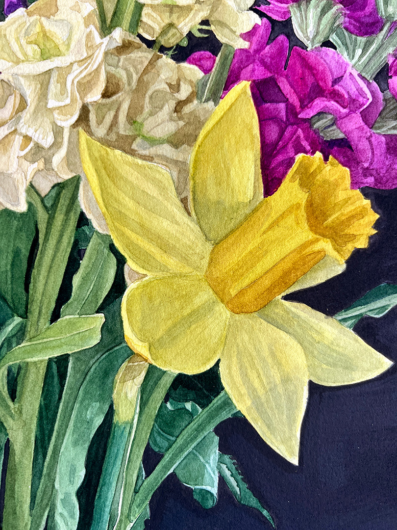
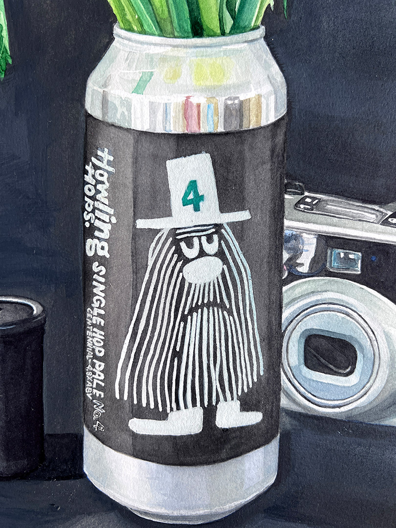
I knew I wanted a black background to evoke the feel of classical flower paintings. Initially, I was attracted to the hipster illustration on the can. However, the elements that represented hipster culture either felt too large and overpowering or were not distinct enough. I also prefer to include personal items from my home in my paintings instead of purchasing new ones. Eventually, I decided to use an old film camera and a plastic canister that I had lying around.
The challenges continued with the background colour. I had to use opaque, impasto layers to create a solid, dark black. However, it ended up being almost too dark, so I added white gouache for highlights and reflections. And exactly these mixed layers of impacto and guache were particularly challenging to reproduce as prints.

